Claude Dashboards
Set up Claude Dashboards beta, inspect SQL and refresh timestamps, check a sales metric, and decide when to keep your BI tool.
Published
 By Omid Saffari

Claude Dashboards lets you ask questions of your company’s connected data and get charts you can inspect and share. For a small company, the useful possibility is answering the next sales question inside a tool you already use, without first rolling out another business intelligence (BI) workspace for reporting. The beta launched on 8 October 2026. Start with one metric you can check against a trusted report. Anthropic’s launch announcement
What Claude Dashboards Actually Does
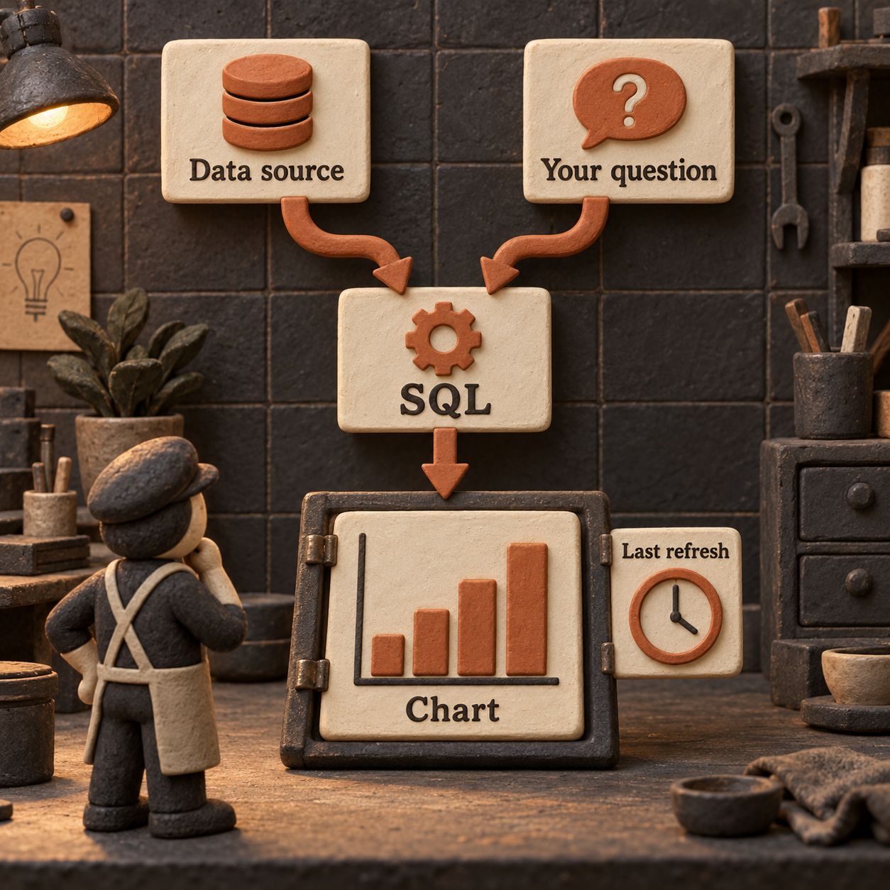
You connect data, describe a question and get a dashboard built around it. A data warehouse is the central store where your company gathers records for analysis. A CRM holds customer and sales records. Claude turns your question into SQL, the instructions a database uses to select and count those records, and runs it against the connected source.
Think of the chart as a receipt with its calculation attached. You can open the query behind a number and inspect the chart’s last refresh. The visual is useful; the visible calculation is what makes review possible. Anthropic positions this for exploratory questions, with deeper analysis continuing in your existing analytics tools. How the beta works
The getting-started guide names Amazon Redshift, BigQuery, ClickHouse, Databricks and Snowflake, plus connected apps such as Salesforce. That is the documented set of examples, not a promise that any CRM or database works automatically. Supported source examples
Which Plans Include It, and What It Costs
Dashboards starts at Pro, and is also available on Max, Team and Enterprise. It is not included on Free. Pro is US$20 billed monthly or US$200 billed annually at the time of writing. The pricing page lists Dashboards as a beta feature. Claude pricing
Dashboard work counts toward your plan’s usage limits. This is not a separate unlimited reporting allowance. On Enterprise, an owner must turn Dashboards on under Organization settings > Artifacts. Dashboards availability and usage
If you already have an eligible plan, a pilot need not add another software subscription. Its cost still includes setup, checking the query, consumption of your Claude allowance and any costs attached to your data source. If you do not have Claude, include the plan purchase in the comparison. A BI tool is not automatically an extra paid seat either; your existing entitlement and deployment matter.
Use your own reporting time for the business case. Here is an illustrative budget, not a measured saving: a month with four reports at 90 minutes each consumes six hours. If a pilot gets each report to 30 minutes including review, that becomes two hours, saving four. A US$20 monthly Pro subscription would then break even at US$5 per saved hour, before setup and data-source costs. If checking the output takes as long as making the original report, the saving disappears.
Set It Up From Data Connection to Sharing
Start on Claude’s web or desktop app so the sharing controls are available. A dashboard lives as an artifact, Claude’s saved, editable output beside a conversation. You can return to it from the Artifacts tab. Artifacts require Cloud code execution and file creation, under Settings > Capabilities for individual plans or Organization settings > Capabilities for Team and Enterprise. Artifacts setup
1. Have the Owner Enable the Right Features
On Team or Enterprise, the owner should check cloud code execution, turn on Artifacts, and enable the Dashboards template under Organization settings > Artifacts. Enterprise starts with Dashboards off; custom roles can restrict access to particular groups. For connected apps inside artifacts, also check Organization settings > Capabilities > Visuals > Enable artifact connectors. Artifacts admin guide
2. Connect the Data You Will Actually Use
Open Customize > Connectors, select +, find the service, review its capabilities, then choose Connect or Install and complete authentication. On Team and Enterprise, an owner first makes the connector available through Organization settings > Connectors > Browse connectors > Add to your team. Users then authenticate, unless the organization uses managed authentication. Enable the service for the conversation through + > Connectors. Connector setup
For a warehouse, involve whoever owns its connection and table permissions. The Dashboards guide names platforms but does not supply one universal warehouse credential form. Follow the selected connector’s requirements. My recommendation for the first pilot is access to one approved reporting table or a view that presents a saved query as a table, with only the permissions needed to read it.
3. Ask a Business Question
Open Artifacts, choose a Dashboards template and describe the question. You can also ask in chat or select Output > Dashboards. Include the table or app, the metric definition and the period. Refine the result through chat, then open the chart’s SQL and correct any mismatch. Create and refine a dashboard
4. Check the Recipient’s View Before Wider Sharing
Open Share and inspect the available audience and access settings. Shared artifacts require a Claude account. Connected parts use the viewer’s own connections; missing source access produces an error. App-connected artifacts cannot use Anyone with the link, and outside email invitees cannot use parts dependent on Claude or your connectors. Artifact sharing rules
For a company dashboard, first share with one intended colleague and have them confirm what they can see. A successful view in your account does not establish that theirs works.
Worked Example: Closed-Won Sales by Region
An operator at a small software company wants to see which regions contributed booked sales last quarter. Use closed-won opportunity value, the value of deals marked won, rather than calling it accounting revenue. A signed deal, an invoice and recognized revenue are different measurements.
For this example, assume BigQuery contains a table named crm.opportunities, with one row per opportunity, an is_won field set to true or false, a region, an amount_usd converted to a common dollar basis and a closed_date stored as a date in the company’s agreed business timezone. These are illustrative field names and assumptions, not an Anthropic schema.
The Question You Type
Build a dashboard answering: which regions contributed the most closed-won opportunity value in Q3 2026? Use crm.opportunities. Sum amount_usd for is_won = TRUE, with closed_date from 1 July 2026 inclusive to 1 October 2026 exclusive, grouped by region. Label it “Closed-won opportunity value, USD”, not recognized revenue. Explain how the query handles missing regions and null amounts before I share it.
This prompt pins down the metric, source, currency and date boundary. It also asks for the awkward cases that a polished chart can hide.
The Query You Check
Open the generated query. Under those assumptions, its essential logic should resemble the following illustrative BigQuery SQL, which has not been run against a real dataset:
SELECT region, SUM(amount_usd) AS closed_won_usd
FROM `crm.opportunities`
WHERE is_won = TRUE
  AND closed_date >= DATE '2026-07-01'
  AND closed_date < DATE '2026-10-01'
GROUP BY region
ORDER BY closed_won_usd DESC;
It selects won deals, keeps close dates inside the quarter and adds their dollar values by region. The exclusive upper boundary keeps 1 October out. It contains no join, so there is no extra table multiplying rows, but duplicates already present in the source could still inflate the sum.
Do not use this unchanged if your warehouse stores opportunity history, multiple line items per deal or timestamps instead of dates. Have the data owner settle the correct record and date rules first. SQL that runs successfully can still answer the wrong question.
What You Verify Before Sharing
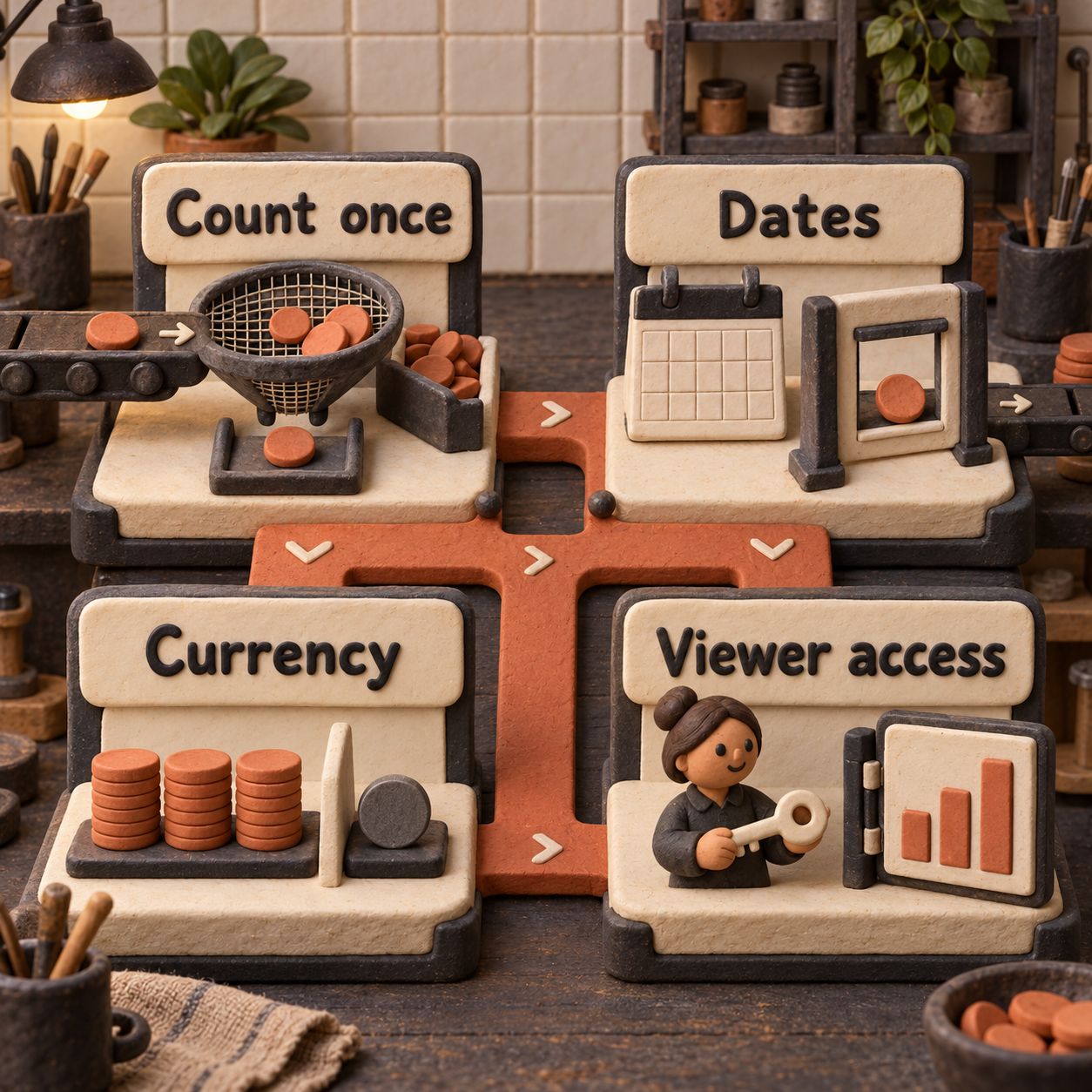
- Count once. Confirm each opportunity appears once in the source. Inspect several deal IDs and reconcile the overall total with the trusted CRM report using the same filters.
- Use the intended dates. Check deals near the quarter boundary. Confirm that close date, rather than creation date or invoice date, is the intended rule.
- Use one currency definition. Confirm how
amount_usdis produced.SUMskips null amounts, meaning missing values, so investigate them; decide how to display missing regions too. - Check freshness at both ends. Read each chart’s last refresh and check when the warehouse last received CRM changes. A recently queried stale table still yields stale numbers.
- Check access and meaning. Have a colleague open the shared dashboard with their own connection. Include the metric definition and any exclusions so a sales total does not get reused as accounting revenue.
If the totals disagree, resolve the discrepancy before adding more charts. Useful follow-up questions include “Which records explain the difference?” and “Does the source contain historical versions of the same opportunity?” The first dashboard earns trust through reconciliation, not appearance.
Six Useful Jobs, Ranked by Likely Payoff
These are proposed uses when the relevant fields already exist in a connected source. They are not reported customer results or additional connector claims.
The best first job has a clear source, a known comparison total and someone responsible for its definition. A broad “show business health” request has none of those advantages.
Where It Fits Beside Looker Studio, Metabase and Power BI
My recommendation is to use Claude for questions still taking shape. Keep a BI tool when the report needs a stable model, maintained distribution or explicit refresh controls.
This is a workflow comparison, not a claim that Claude exports directly to these three products. For a broader reporting shortlist, see Databox alternatives.
What It Cannot Settle for You
It cannot turn an ambiguous metric into an agreed business definition. That is my practical assessment of this workflow: “revenue,” “active customer” and “resolved ticket” need an owner who decides what counts. Nor does drawing a chart repair missing records upstream.
A live connection is not a freshness guarantee. The launch describes dashboards staying current, but the getting-started article specifies no refresh interval. It also gives no dashboard, chart or row quota. Treat these as unpublished details, not unlimited capacity. Neither the launch announcement nor this guide publishes Dashboard accuracy results. Launch, getting-started guide
It cannot grant source access a connector does not have. Ordinary connections inherit the user’s permissions; a shared credential instead carries that credential’s access. Check which arrangement your connection uses. Connector permissions
I would keep contractual freshness commitments, audited reporting and complex shared metric definitions in a system your team already operates for those requirements. Test the beta on a bounded internal question first. Its visible SQL helps you review the work; it does not certify the answer.
Two Things Worth Building Around It
The opportunities here are services and supporting assets. The getting-started guide does not establish a developer API for the Dashboards feature, so neither proposal depends on one.
Strongest: A Sales Metric Setup and Validation Service
A small company could pay a specialist to turn one messy sales question into a documented metric, an approved warehouse view, a Claude dashboard and a reconciliation checklist.
DataForSEO’s US English snapshot, retrieved 10 October 2026, estimates 1,000 monthly searches for “sales dashboard.” That shows interest in the reporting job, not proven demand for this service. The suggestions response reports a 32% yearly decline, so this is not a growth-market claim.
The smallest sellable engagement covers one sales metric, a known comparison report, connection setup and a handover to the person who owns the number. The catch is that source cleanup may dominate the work. Scope that separately. This is the strongest opportunity because the valuable deliverable is an agreed, checked number, something a generic chart generator cannot supply on its own.
Second: A Dashboard Review Starter Kit
A consultant could build a reusable kit for operators: metric-definition worksheets, prompt examples, query-review questions and a sharing acceptance checklist. Offer an assisted first review before trying to sell a standalone product.
The same DataForSEO snapshot estimates 140 US monthly searches for “ai dashboard generator.” Related searches include “Ai dashboard generator free,” suggesting price sensitivity. Its suggestions response reports a 47% yearly decline. Those modest signals favor a small experiment, not a large software investment.
An initial kit could cover the sales example and a support backlog example with clearly stated data assumptions. Its weakness is easy imitation and free alternatives. Industry-specific definitions and thoughtful review would need to justify the purchase. For packaging repeatable reporting instructions, see Claude Skills for weekly client reports.
How to create a sales dashboard?
Choose the decision first, then define the records, date field and metric. Connect the source, build one chart and reconcile its total with a trusted report before expanding it. Use the setup and worked example above as the pilot.
What are sales metrics?
They are measurements of sales activity or outcomes, such as open pipeline value and won deals. Define the unit, period and exclusions. Closed-won opportunity value and recognized revenue should not share a label merely because both use currency.
What is KPI in a dashboard?
A key performance indicator is a metric chosen to judge progress toward a business objective. A dashboard can contain many measurements; the KPI should connect to a decision and have an owner responsible for its definition.
What is a good KPI dashboard for sales?
One the sales team can explain and act on. Start with the decision your meeting needs to make, use agreed definitions and show enough context to distinguish a real change from a date, currency or data-quality issue.
Your Monday Move
Pick the operator who currently exports the weekly sales report. Pair them with the person who owns its source table. Build only the closed-won view, compare totals, check the refresh timestamp and open it from the intended colleague’s account. Record the full time spent, including corrections. Expand only if the pilot makes that reporting job easier without losing a clear definition of the number.
If you want a checked reporting workflow built around your data, we can help with AI automation.
- Published
- Category
- AI
- Language

Granola AI Review
Granola reviewed for business meetings: bot-free notes, current pricing, templates, recipes, consent, platform limits and who should choose an alternative.Oct 10, 2026AI
Fyxer Review
Fyxer reviewed through current pricing, help docs and public feedback: inbox sorting, drafts, meetings, privacy and who should pay for Pro or Team.Oct 9, 2026AI
GPT 6 Explained: Models, Release Dates, Access, and Prices
GPT-6 Astra, Sol, 6.1 Sol and Luna explained: release dates, ChatGPT plan access, Work and Codex availability, and verified API costs.Oct 9, 2026AI
Is ChatGPT Free? What You Get for $0
Yes. See what ChatGPT Free includes, its work limits, ads, account access, and when the $8 Go or $20 Plus plan is worth paying for.Oct 9, 2026AI
Gemini Enterprise: What It Is and When to Pilot
Gemini Enterprise explained for IT leads: Gemini agent availability, connectors, identity, spend caps, pricing and a 30-day Plus pilot.Oct 9, 2026AI
Marblism Review
Marblism's seven AI employees, current plans, shared-hour costs, dated public reviews and the jobs that still need human approval.Oct 9, 2026AI
Claude Haiku vs Sonnet
Haiku 5.5 vs Sonnet 5.5 for ticket classification, long summaries and coding subagents, with current API rates and three monthly budgets.Oct 8, 2026AI