Nano Banana prompts: the structure that actually works for design
The prompt structures, creative-director controls, and copy-paste recipes that get usable design work out of Nano Banana, and where it still breaks.
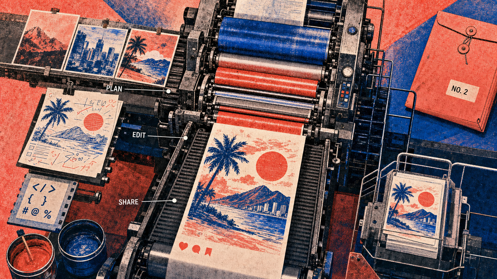
Nano Banana will follow a sloppy prompt literally and hand you slop. The designers pulling clean, on-brief images out of it are not using better words. They are using a structure: a strong verb, a scene described like an art-director brief, and one change at a time.
The one structure behind every good Nano Banana prompt
Start the prompt with a verb that names the job, then describe the scene the way you would brief a photographer, not the way you would tag a stock library. That single habit separates usable output from the generic gloss that floods every prompt-dump roundup.
Nano Banana is Google's image model, built on the Gemini 3 family, and it reasons over your prompt before it renders. So it rewards instruction over keyword soup. The official text-to-image recipe is five slots:
[Subject] + [Action] + [Location/context] + [Composition] + [Style]
Composition is just the framing (how tight, what angle). Style is the look or medium (editorial photo, flat illustration, 3D render). Fill all five and you give the model a scene instead of a wish.
Then iterate conversationally. Get the scene roughly right in one sentence, then change one element per turn. Trying to fix lighting, pose, and background in a single rewrite is how you lose the parts that were already working.
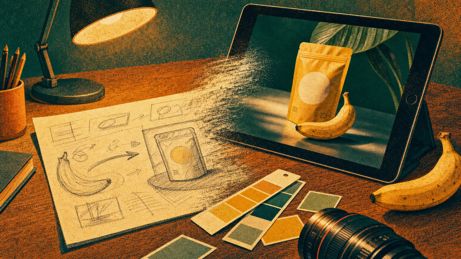
Product and brand shots
For product and packaging work, the formula plus three explicit controls (light, lens, material) gets you most of the way to a usable hero image.
Start vague and you get the problem everyone complains about. Prompt "a water bottle on a table, nice lighting" and Nano Banana hands you a generic catalog render: flat front-on angle, plasticky highlights, a surface that reads as nothing in particular. Nothing is technically wrong; nothing is sellable.
Now brief it like a shoot:
Photograph a matte black stainless-steel water bottle standing on a pale oak table. Soft morning light from the left, shallow depth of field, shot from slightly above. Photorealistic, warm and minimal.
The fixes that matter are the specifics. Materiality is the biggest lever: do not ask for "a bottle," ask for "matte black stainless-steel." Name the surface the way a set designer would ("navy tweed," "brushed aluminum," "glazed ceramic") and the render stops looking synthetic. Lighting and camera do the rest: "soft morning light from the left" and "shot from slightly above" replace the default dead-on studio look with something that reads like a real photograph.
You can run Nano Banana free in the Gemini app, but Google AI Studio is where you get the full set of controls these recipes assume, and how much you can generate comes down to which tier you pay for.
Text, logos, and posters: the thing most image tools fail
Nano Banana renders sharp, legible text, which is the one capability that historically broke every image model. To get it, follow three rules and you can ship posters and mockups, not gibberish.
First, put the exact words in quotes: render "URBAN EXPLORER", not "the words urban explorer." Second, name the typography: "bold white sans-serif" or "a thin, minimalist Century Gothic." Third, use the text-first hack for anything wordy: ask Gemini to write the copy in conversation first, then ask it to render an image using that exact text. It also handles multilingual type in more than ten languages, so you can write the prompt in English and specify a target language for the text on the poster.
Generate the copy in chat
Ask for the headline and subhead as text first. Lock the words before any pixels exist.
Render with the words in quotes
"A typographic poster, solid black background, the word 'GLOW' in a flowing brush-script font centered in the frame."
Localize if needed
Add "translate the headline to Korean" and it re-renders the type, not just the caption.
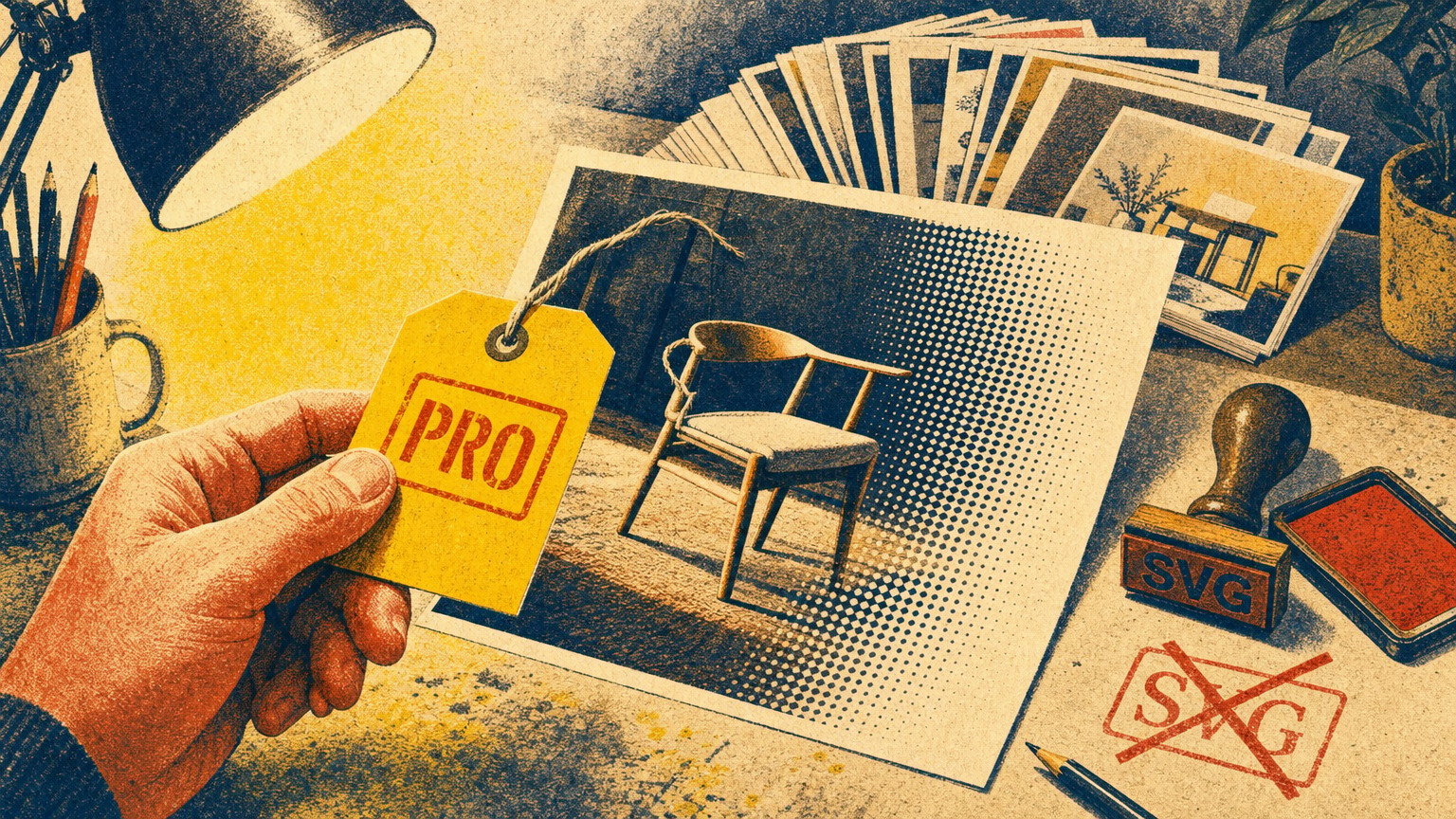
Here is the craft bar, and it is a hard one: Nano Banana outputs raster, not vector. Raster is a grid of pixels; vector is editable math that scales to any size, which is what a real logo has to be. So Nano Banana is superb for exploring logo and lockup directions and for finished poster art, but the moment you need an editable, infinitely scalable mark, you take the direction it gave you and rebuild it in a vector tool. Treat its logo output as a mood board, not a deliverable.
Editing and consistency: change one thing, keep the rest
Editing needs the opposite instinct from generating. You already have an image, so your prompt should name what changes and, just as importantly, what must stay identical.
Nano Banana edits through text, what Google calls semantic masking: you "mask" a region with words instead of a brush. "Remove the man from the photo" or "replace only the background with a plain white studio sweep, keep the product exactly the same" works because you told it what to protect. Leave that out and it happily redraws the thing you wanted to keep.
For consistency across a series, two tools matter. You can feed up to 14 reference images in one prompt, and you can lock identity explicitly. Want the same mascot, product, or character across a campaign? Upload a clean reference and instruct it to keep that subject's identity exact while you change the scene around it. The community pattern that works for repeatable brand work is the same idea applied rigorously: a clear reference plus an explicit "keep identity exact" line.
- Swapping backgrounds while protecting the product
- Style transfer (recreate this photo as a flat illustration)
- Holding a character or product across several scenes with references
- Drift: after many conversational edits, small details mutate. Restart from a clean base when that happens.
- Exact brand color fidelity. Verify hex against your real palette; do not trust the screen.
Prompt like a creative director
The gap between "good" and "breathtaking" output is the set of controls the prompt lists never mention. Direct the scene the way a creative director directs a shoot.
- Lighting: name the setup. "Three-point softbox" for clean product light, "chiaroscuro, harsh high contrast" for drama, "golden-hour backlighting with long shadows" for warmth.
- Camera and lens: the hardware changes the whole visual DNA. "Shot on a Fujifilm" gives authentic color science; "disposable camera with flash" gives raw nostalgia; "low angle, f/1.8 shallow depth of field" forces cinematic focus; "macro lens" for detail; "wide-angle" for scale.
- Color grading and film stock: "as if on 1980s color film, slightly grainy" or "cinematic grade, muted teal tones" sets the emotional temperature.
There is also a web-grounded mode worth knowing: both current models can pull real-time information from search. The formula is [Source/Search request] + [Analytical task] + [Visual translation], for example "search the current weather in San Francisco, then visualize that as a tiny city inside a coffee cup." It is niche, but for data-driven or topical visuals nothing else does it in one step.
When to go structured (JSON), and when not to
Reach for a structured JSON prompt when you need the same look repeated across a series; stay in natural language for everything else. That is the honest call.
A pattern that has spread through the design community in 2026 is writing prompts as JSON, with explicit keys for subject, camera, style, photographic_quality, and aspect_ratio. The payoff is repeatability: once a block produces the look you want, you change one value and regenerate, and the rest holds. The cost is friction. For a one-off hero image it is overkill and natural language is faster and often more creative. For a ten-image product set that must match, the structure earns its keep.
A few hard specs that bound any prompt you write:
Where Nano Banana still breaks, and the workaround
Even with a perfect prompt, three limits decide whether output is ship-ready. Know them before you promise a client a deliverable.
No vector output. Raster only. Fine for photos, posters, and exploration; rebuild any logo or icon in a vector tool before it ships. A visible provenance signal. Every image carries an invisible SynthID watermark and C2PA credentials, by design. That is honest, but know it is there if a client asks about AI disclosure. Edit drift. Long conversational edit chains slowly corrupt details; when the image starts mutating, restart from a clean generation rather than fighting it. None of these are dealbreakers. They are the line between "use it in real work" and "use it to explore," and a working designer should know which side a given task sits on.
What is the best Nano Banana prompt structure?
Start with a strong verb, then fill five slots: Subject, Action, Location/context, Composition (framing), and Style (the look or medium). Describe it like an art-director brief, not a keyword list.
Why does Nano Banana ignore 'no text' or 'no people' in my prompt?
It responds to what you name, not what you negate. Use positive framing: describe the empty, clean version you want ("a bare studio backdrop") instead of listing what to remove.
Can Nano Banana put accurate text in an image?
Yes. Put the exact words in quotes, name the font style, and for longer copy generate the text in chat first, then render. It produces legible type in more than ten languages.
How many reference images can I use at once?
Up to 14 in a single prompt, which is what makes character and product consistency across a series possible.
Want the next breakdown like this, plus the prompts and tools worth your time, in your inbox? Join the newsletter.
Jun 29, 2026