Nano Banana Pro prompts: the structure that gets studio-quality results
The prompt structure that turns Google's Nano Banana Pro into a real design tool: the scene spec, camera and light control, and where it breaks.
Nano Banana Pro will follow a sloppy prompt straight off a cliff. The gap between the slop that floods your feed and a clean, studio-grade frame is not a secret seed or a magic phrase. It is structure, and Google published the exact framework the prompt-pack sites are quietly reselling you.
The fastest way to get a better image out of Nano Banana Pro is to stop writing keywords and start writing a brief. The model is Gemini 3 Pro Image, built on the same reasoning engine as Gemini 3 Pro, so it reads a prompt the way an art director reads a creative brief: it wants a subject, a frame, a light, and a job for every reference you hand it. Give it those and it produces clean, legible, repeatable work. Give it "logo, modern, 8k, ultra HD" and it gives you average.
This is the method that gets professional output, built on Google's own seven-tip framework and the craft layer that turns the framework into work you can actually ship.
The one rule that fixes most bad output
Specific beats long. Almost every weak result comes from a prompt that is vague, not one that is short.
Because Nano Banana Pro reasons over your words instead of pattern-matching them, padding a prompt with quality tags ("masterpiece, 8k, ultra-detailed, award-winning") does close to nothing. The model already aims for fidelity. What it cannot do is guess the things you left out: how the shot is framed, where the light comes from, what the mood is. Those gaps are where it improvises, and improvisation is where slop lives.
So the rule for every prompt below: name the thing you actually care about, and cut the decoration. "A ceramic coffee cup" is weak. "A matte-black ceramic cup, top-down, on a raw concrete counter, hard mid-morning window light from the left" is a direction the model can execute the same way twice.
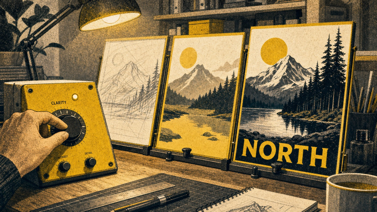
The six-part scene spec
Build the prompt from six parts and you cover what the model needs before it has to guess. This is Google's own checklist, and it works because each part closes one of those improvisation gaps.
- Subject: who or what is in the frame, stated concretely. Not "a robot," but "a stoic robot barista with glowing blue optics."
- Composition: how the shot is framed: extreme close-up, wide shot, low angle, portrait.
- Action: what is happening: brewing coffee, mid-stride, casting a spell.
- Location: where it takes place: a futuristic cafe on Mars, a sun-drenched meadow at golden hour.
- Style: the overall aesthetic: photorealistic, film noir, 1990s product photography, flat vector.
- Editing instructions: when you are modifying an existing image, be direct: "change the man's tie to green," "remove the car in the background."
Walk a real before and after. Start with the lazy version: "a sneaker product photo, clean, professional." You get a generic shoe on a generic seamless backdrop, fine for a placeholder, useless for a brand. Now spend the six parts: "A single white leather low-top sneaker (subject), shot at a three-quarter hero angle, filling 60% of the frame (composition), resting still on a brushed-concrete plinth (action and location), in the style of premium 1990s catalog product photography with soft directional studio light (style)." Same model, same five seconds, but now you have a frame you can put in a deck.
The first version is a search. The second is a brief. The model rewards the brief every time.
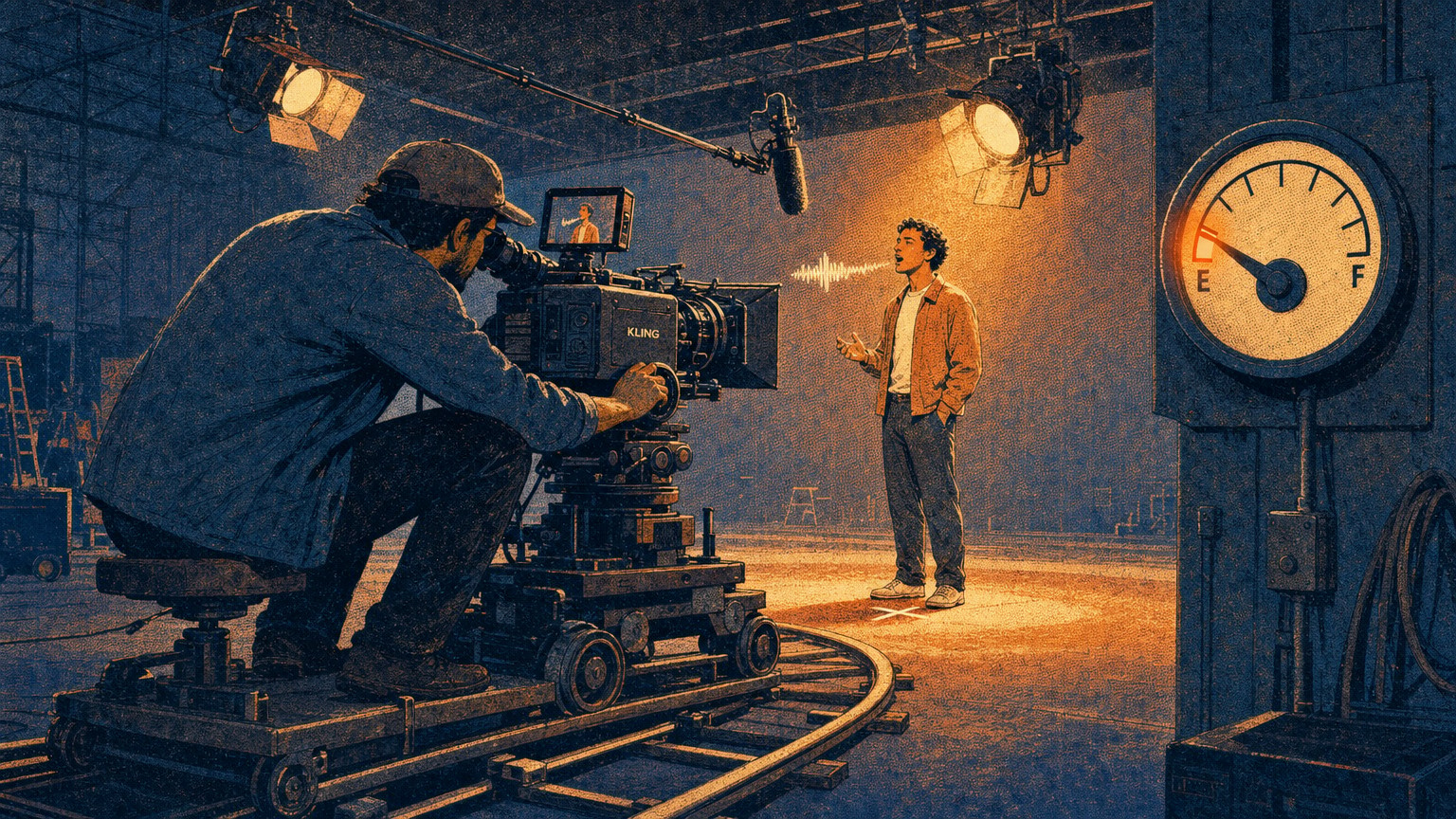
Direct it like a cinematographer
Once the scene is set, the controls that separate amateur from studio are the same ones a photographer uses: the frame, the lens, and the light. Nano Banana Pro understands all three in plain language.
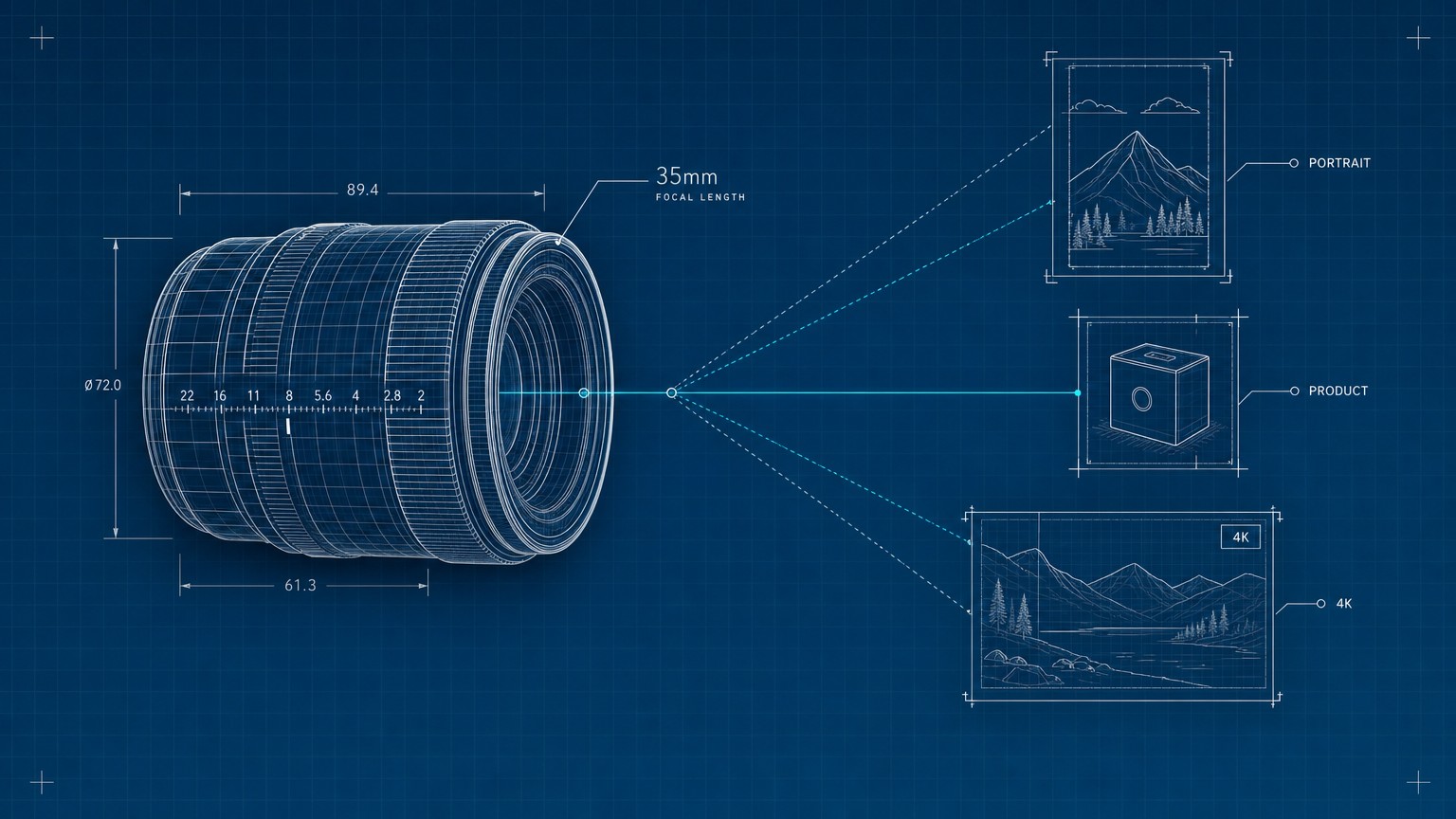
Set the canvas first. State the aspect ratio, which is just the shape of the frame, the ratio of width to height. Square (1:1) for an icon or a social tile, 16:9 for a wide hero or a slide, 9:16 for a phone-vertical poster or a story, 21:9 for a cinematic letterbox, 4:5 for the tall format that performs on a feed. Naming it up front stops the model from cropping your subject to fit a shape you did not want.
Then direct the camera. You can borrow a cinematographer's vocabulary and the model will honor it:
- "A low-angle shot with a shallow depth of field (f/1.8)": depth of field is how much of the scene is in focus; shallow means the subject is sharp and the background melts to a soft blur, the look that reads as expensive.
- "Golden hour backlighting creating long shadows": names both the quality of the light and its direction.
- "Cinematic color grading with muted teal tones": color grading is the deliberate tint laid over the whole image, the thing that makes a frame feel like a film still instead of a snapshot.
Lock the frame
Open with the aspect ratio and the shot type: "A 4:5 portrait, eye-level medium shot."
Light it
Name the source, direction, and quality: "soft window light from camera-left, gentle falloff into shadow."
Grade it
Add the color treatment last: "warm, slightly desaturated color grade, filmic contrast."
That three-line stack, frame then light then grade, is the difference between an image that looks generated and one that looks shot. It costs you fifteen extra words.
Text that actually renders
If you need legible words inside the image, Nano Banana Pro is the best tool there is right now, but only if you treat the text as a directed element, not an afterthought.
This is the model's headline strength. It renders correct, readable text directly in the image across multiple languages, which is why it has become the go-to for posters, mockups, and infographics where every other image model produces gibberish lettering. The trick is to state three things: the exact words, the typographic style, and the placement.
"The headline 'URBAN EXPLORER' rendered in bold, white, sans-serif type at the top third of the frame."
Name the string in quotes so the model knows precisely what to spell. Name the style (bold, condensed, a handwritten script, a specific era) so it matches your brand. Name the position so it does not float into your subject. For a product mockup or a poster, that level of control is the whole reason to use this model over Midjourney, which still cannot reliably set a single clean line of type.
Reference images and the role-assignment trick
When you feed Nano Banana Pro reference images, the single biggest upgrade to your output is telling it what each image is for. It accepts up to 14 reference images in one composition (the exact cap varies by where you use it) and can hold the resemblance of up to 5 people across a scene, which is what makes it usable for real brand and character work instead of one-off art.
The mistake is dumping three images in and hoping. The fix is to assign each one a job in the prompt:
"Use Image A for the character's pose, Image B for the art style, and Image C for the background environment."
Now the model is compositing with intent instead of averaging your inputs into mud. This is the move that lets a brand owner keep the same founder's face across a whole campaign, or an agency hold a mascot consistent across ten touchpoints. Without role assignment, a four-image blend tends to produce one muddy hybrid; with it, each reference does exactly one job.
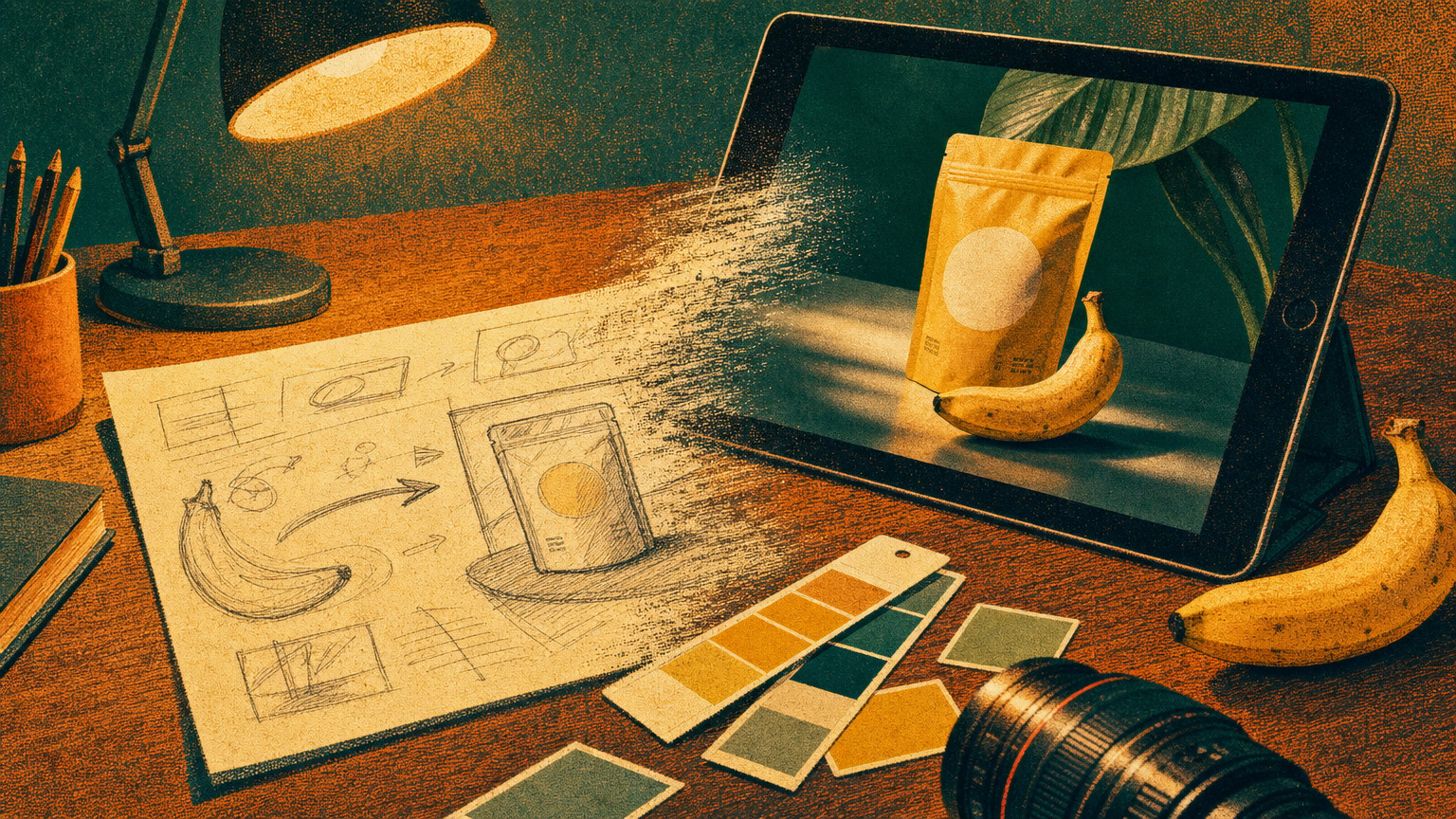
The brand-consistency prompt: build a reusable spec block
For brand work, stop writing a fresh prompt every time and start reusing one structured spec. The reproducible way to keep a look consistent is to define the brand once, as a labelled block, and paste it into every generation.
Write your visual identity as an explicit spec the model can read the same way every run:
Brand spec: Primary color deep navy (#10203A), accent warm coral. Typography: bold geometric sans for headlines, all-caps. Mood: confident, minimal, lots of negative space. Logo: a simple coral circle mark, top-left.
This asset: Apply the brand spec to a 4:5 social tile announcing a product launch, with the headline "SHIP IT" centered.
Keeping the identity in a fixed block does two things: it stops the model from drifting between generations, and it lets you change only the "this asset" line to spin out a whole campaign on one consistent look. The model is also strong at draping a defined design, a pattern, a logo, an artwork, onto 3D objects and mockups while keeping the lighting natural, so the same spec block carries from a flat tile to a packshot.
This is where a solo founder gets the most leverage: one tight brand spec block turns the model into a junior designer who never forgets the style guide. An in-house team can version the block in a shared doc so everyone generates on-brand by default.
Where it breaks, and the workaround
Every honest method names the failures. Google lists Nano Banana Pro's, and each one has a practical fix you can build into your workflow.
- Legible headline text directly in the image, across languages
- Holding up to 5 people or a product consistent across a scene
- Real-world-grounded infographics and diagrams via Search
- Studio-grade light, lens, and color control from plain language
- Native output up to 4K
- Small text and fine detail can scramble or misspell
- Data in diagrams can be confidently wrong
- Multilingual text may carry grammar or cultural errors
- Heavy blends and lighting edits can leave artifacts
- Character features can drift across successive edits
The workarounds, mapped one to one:
- Small text scrambles → generate the big hero type only, then set body and legal copy in your design tool over the image.
- Diagram facts are wrong → never trust a generated chart's numbers; feed the real data in the prompt and verify every label by eye before it ships. Search grounding helps, it does not absolve you.
- Multilingual slips → have a native speaker proof any translated text before it goes to a paid campaign.
- Blend artifacts → reduce the number of references, assign clearer roles, or composite the final stack manually instead of asking for one heroic blend.
- Character drift → lock your hero reference images and regenerate from them rather than editing an edit of an edit.
Resolution and export: pick the right tier
Generate at the resolution the job needs, not always the maximum. Nano Banana Pro outputs natively at three tiers: 1K (1024px) for quick drafts and social, 2K (2048px) for most finished web and presentation work, and 4K (up to 4096px, around 16 megapixels) for print, large format, or anything you will crop into hard.
Higher tiers cost more time and money per image, so draft your composition at 1K, iterate the prompt until the frame is right, then re-run the winning prompt once at 4K for the final. Every output also carries an invisible SynthID watermark marking it as AI-generated, which is worth knowing if you are placing work where provenance matters. You reach all of this through the Gemini app for casual use, or Google AI Studio and Vertex AI when you want the model controls and API access.
For what each surface costs and which tier of access you actually need, the Nano Banana Pro pricing breakdown maps it out. And if you are still deciding whether this is the model to standardize on, see where it lands against the field in the 2026 AI image generator comparison; for pure style exploration, Midjourney still pulls ahead on illustration and mood.
What are the best Nano Banana prompts to copy and paste?
Copy-paste packs are a fine way to see the model's range, but they are a starting point, not a method. The model rewards a structured scene spec, subject, composition, action, location, style, far more than a borrowed string. Use a pack to learn the phrasing, then write your own brief around your actual subject. A prompt built for your scene beats a generic one every time.
How do I write prompts to enhance image quality?
Quality comes from direction, not from quality tags. Stacking "8k, ultra-HD, masterpiece" does almost nothing because the model already aims for fidelity. Instead name the things that actually shape quality: resolution tier (generate at 2K or 4K), a real camera and lens cue ("shot on a 50mm lens, shallow depth of field"), and explicit lighting ("soft directional window light"). Those move the output far more than any adjective pile.
Can I use Nano Banana Pro prompts for photo editing?
Yes, and it is one of its strengths. Upload the image and give a direct edit instruction that references what is already there: "change the jacket to forest green," "remove the sign in the background," "relight this as golden hour." Be specific about the one change you want; vague edit prompts make the model rework things you wanted to keep.
What makes Nano Banana Pro better than other models for text?
It renders correct, legible text directly inside the image across multiple languages, where most image models still produce scrambled letters. Quote the exact words, name the type style, and state the placement, and it will set a clean headline. The caveat is scale: keep generated text large and short, because small text and long paragraphs still misspell.
Jun 29, 2026